Playfit
Webeez built a complete premium brand identity for Playfit Fitness Center — logo, packaging mockups, merchandise, social media kit, and more. One bold palette. One powerful tagline. Don't Quit.
Overview
A premium fitness brand identity built to motivate, intimidate, and last.
When Hamid approached Webeez for Playfit, his brief was clear — he wanted a fitness brand that felt premium and powerful, not generic. A brand where the logo commanded respect, the colors were bold and consistent, and every touchpoint from packaging to merchandise carried the same unmistakable energy. The tagline said it best: Don't Quit.
Brand Colors
- Charcoal Black
#1A1A1A
- Playfit Lime
#8DC63F
- Off White
#F5F5F3
Deliverables
A complete brand ecosystem — consistent from the logo to the gym floor.
- Logo Design
- Brand Identity & Guidelines
- GYM Packaging Mockups
- Business Card
- Letterhead
- Social Media Kit
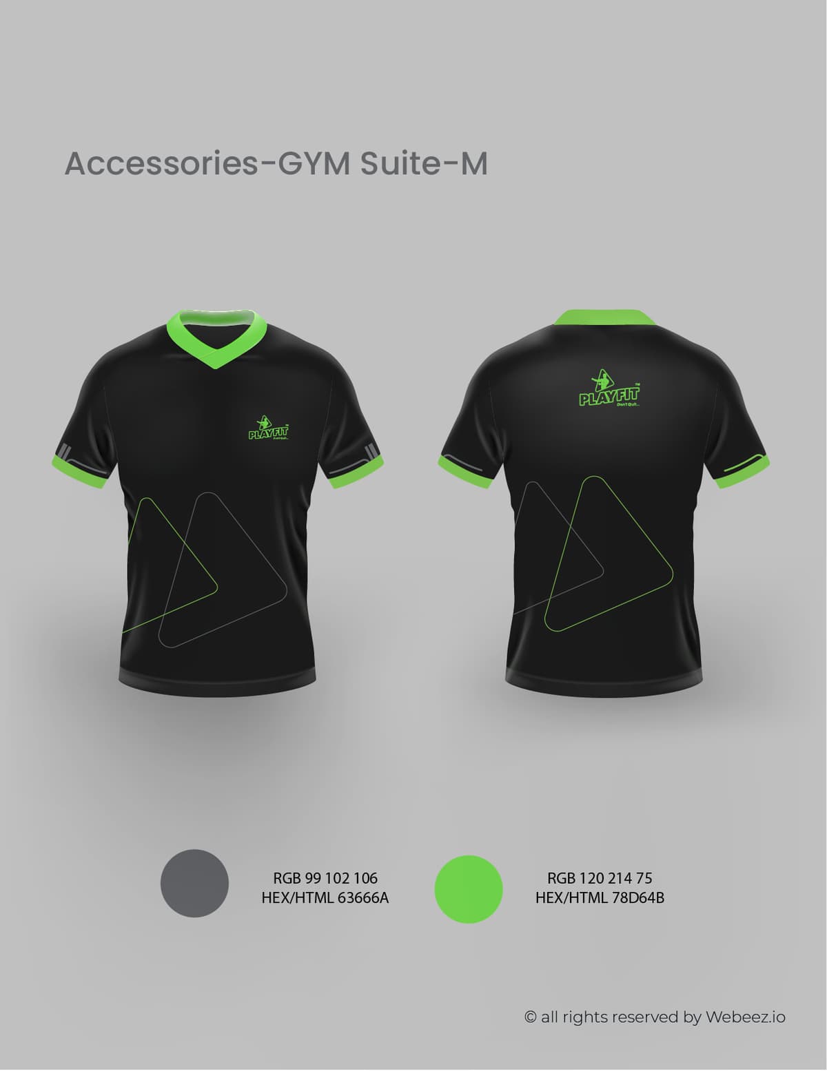
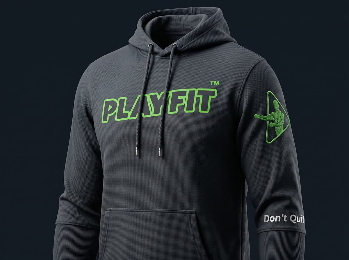
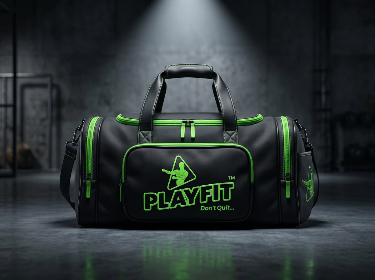
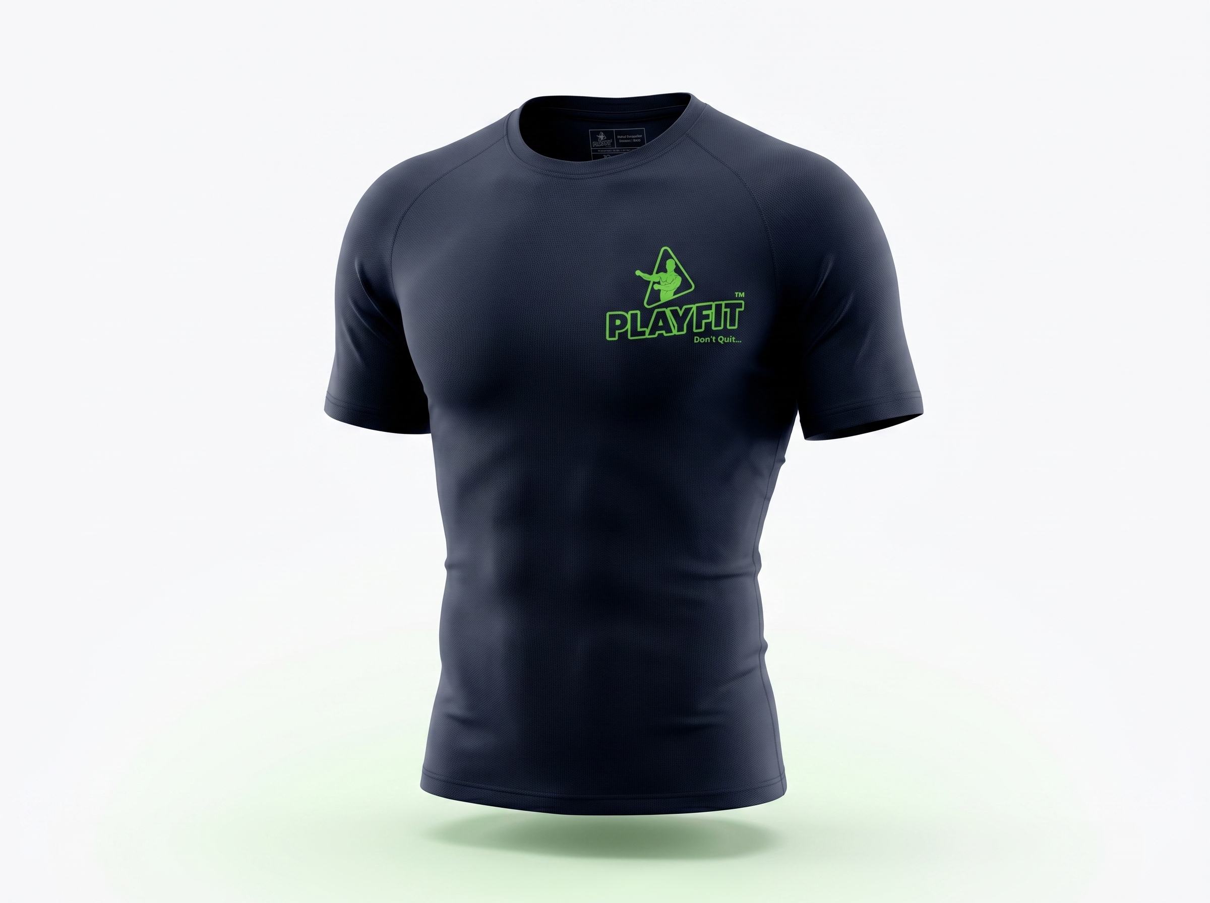
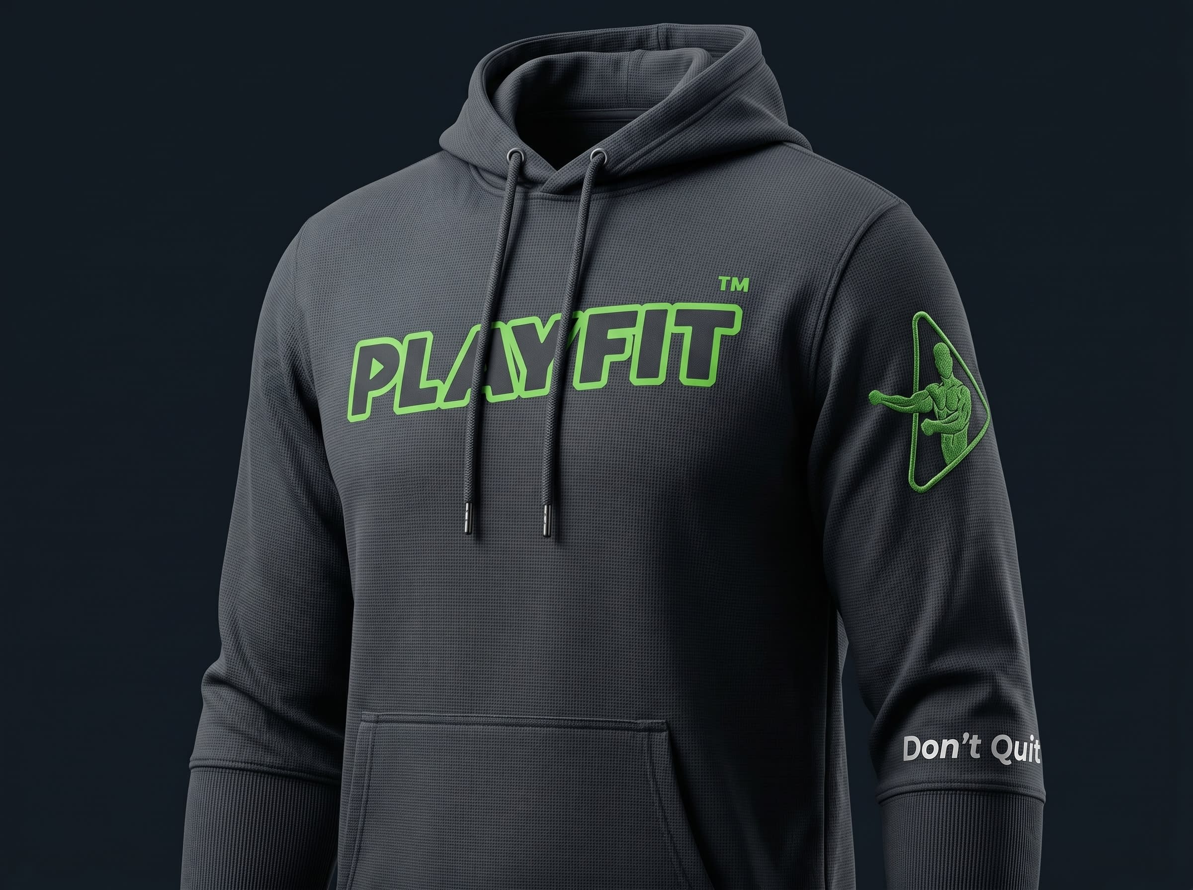
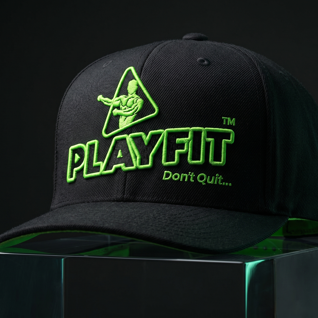
- T-shirt & Merchandise
- Brand Stamp & Sticker
Our Process
- Brief & Vision Alignment
Hamid walked us through his vision for Playfit — a fitness center that needed to feel premium, not just functional. He wanted a brand that members would wear proudly, display confidently, and immediately recognise. The theme color was to be the spine of the entire identity, running consistently across every single deliverable.
- Logo Design & Identity Development
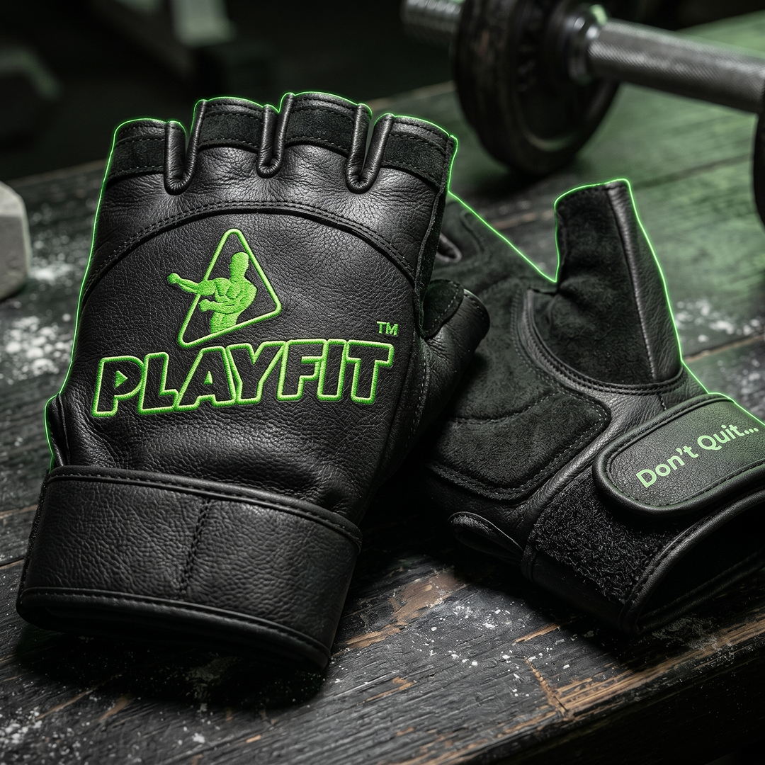
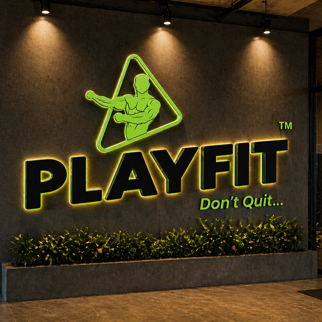
We built the Playfit logo to be bold, athletic, and scalable — a mark that would work equally well embossed on a supplement jar, printed on a t-shirt, or stamped on a business card. The dynamic athlete icon and strong wordmark were designed to project energy and premium positioning simultaneously.
- Color System & Brand Guidelines
The Playfit palette — charcoal black and electric lime — was locked in as the brand's visual signature. We documented usage rules, proportions, and application guidelines so the color system stays consistent across every medium, now and in the future.
- Brand Ecosystem Build-Out
With the logo and palette approved, we extended the identity across the full brand ecosystem — GYM packaging mockups, business cards, letterhead, social media templates, merchandise designs, and stamp and sticker artwork. Every asset was designed as part of one cohesive system, not as isolated pieces.
- Delivery & Handover
All final brand assets and working files were compiled and delivered to Hamid — ready for immediate use across digital and print applications. The Playfit brand was handed over as a complete, production-ready identity system.
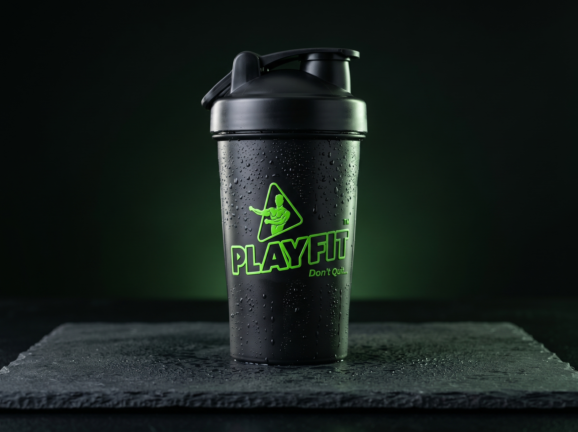
Packaging Spotlight
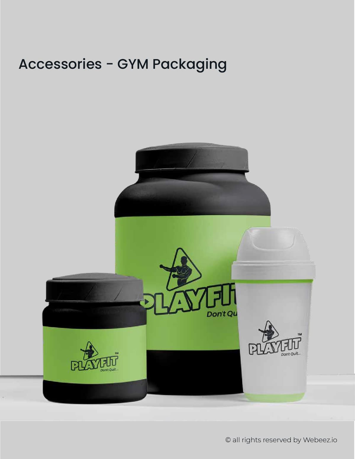
- GYM Packaging Mockups
The supplement packaging was one of the most impactful deliverables — applying the Playfit brand to protein jars, supplement containers, and shaker bottles. The lime green label band against the matte black packaging created an instantly recognisable product aesthetic that stands out on any shelf.
Like What You See?
We'd love to work with you on your next project.